Love Leaf Tea
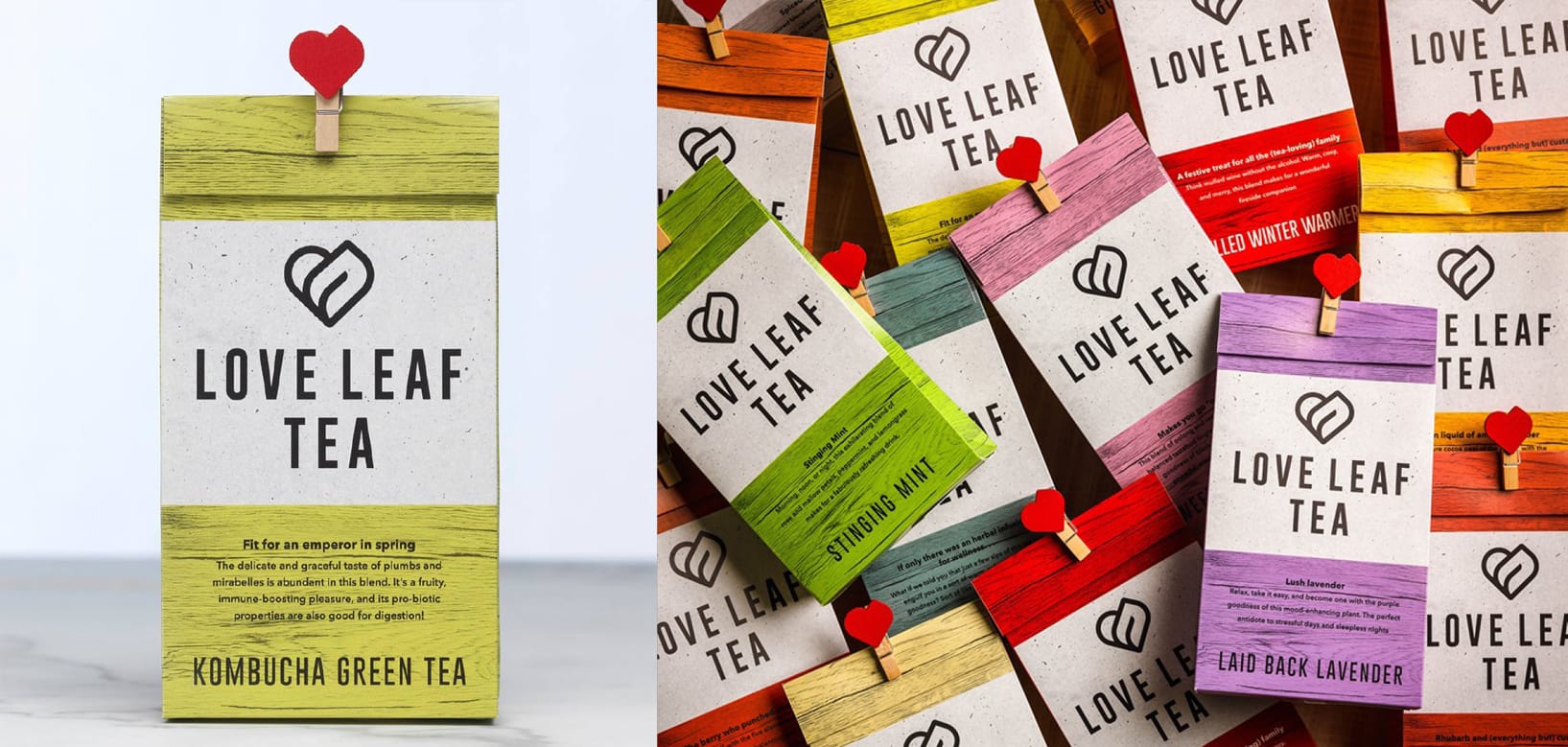
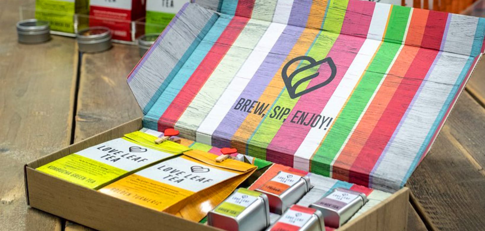
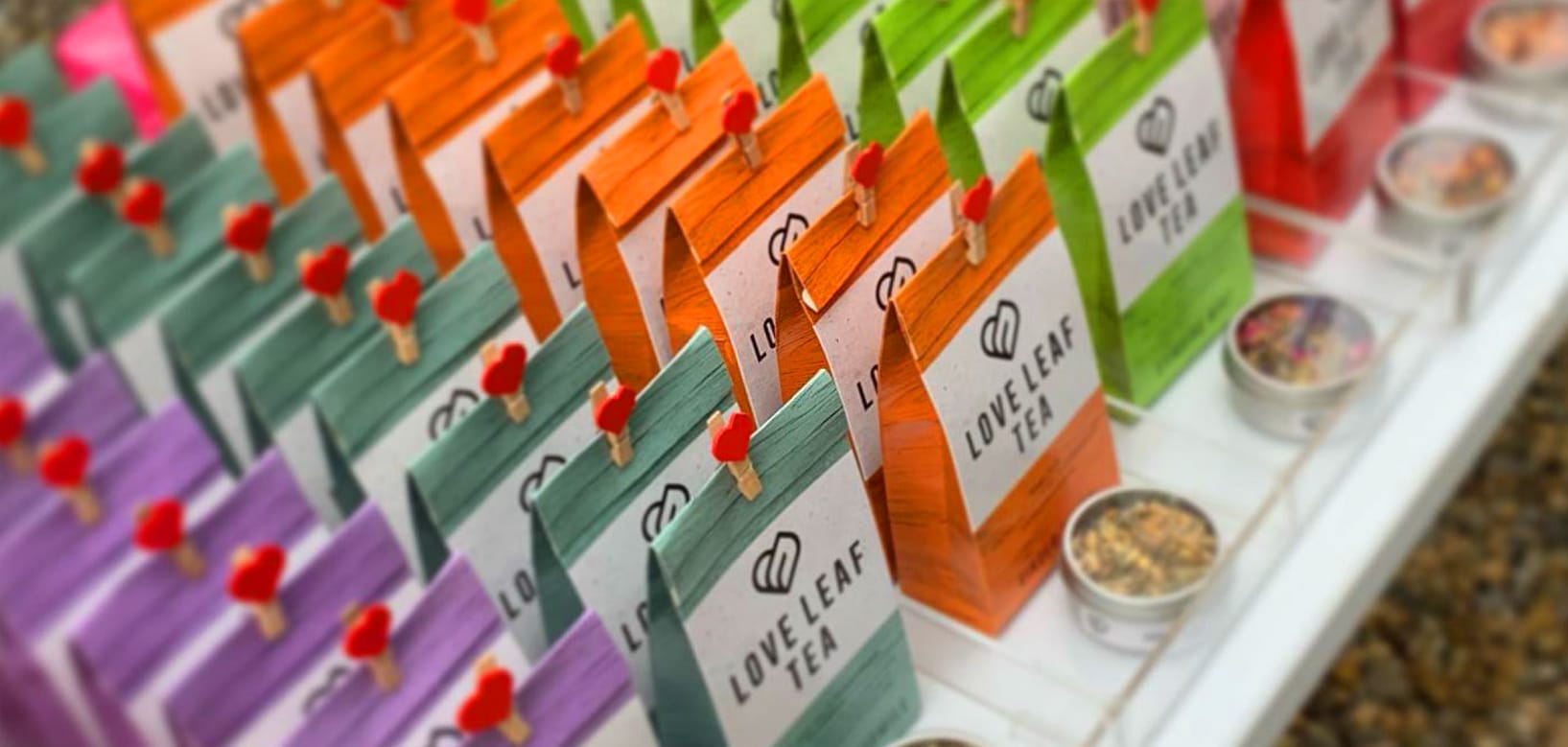
Love Leaf Tea had an established logo, supplying loose leaf tea to local cafes and restaurants, with some direct customer sales coming from a small online presence. Our brief was to rebrand to appeal to a wider consumer audience, and to sell direct to the public. The focus to be on packaging initially, the logo and device also had to work online and with beverage pop-ups in a crowded retail environment.
The logo embodies ‘love’ and ‘leaf’ as a nod to the original brand, clean lines and font appeal to a wider audience. Fusing wood from vintage tea chests with contrasting cool concrete captures a contemporary urban feel, while pop colours are used to define the product range.